Anyone can work for the common good and shape public opinion, but obviously, only with the tools at their disposal: a politician in a democratic country with the tools of power, your neighbour with a message wrapped and posted in A4 plastic film and a graphic designer with provocative images. Sometimes the third can have a greater impact than the others and everybody else put together. At least, that's what the example of a now somewhat forgotten Hungarian designer shows.
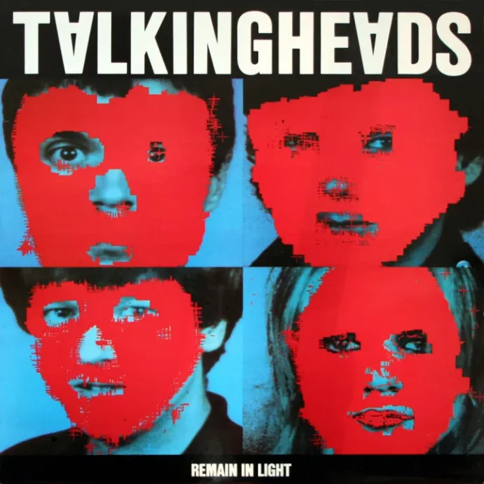
“Tibor Kálmán is universally acclaimed as one of the greatest and most gifted graphic designers in the history of mankind. A true creative genius and a passionate rebel, his highly celebrated work for the Talking Heads, Restaurant Florent, Interview, and Colors left behind an immense influence on art, literature, society, culture and morality.”
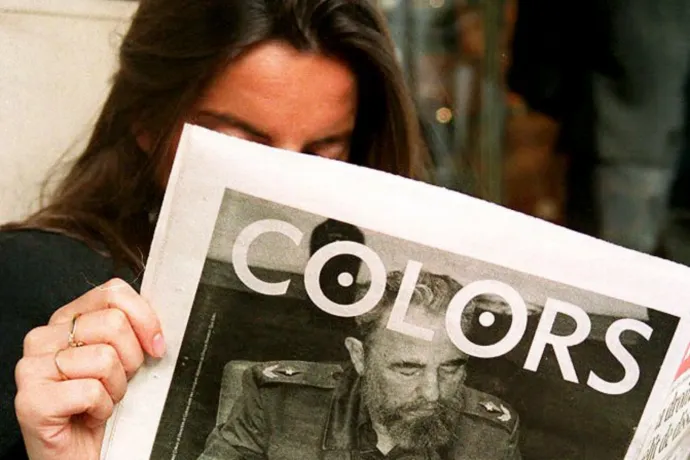
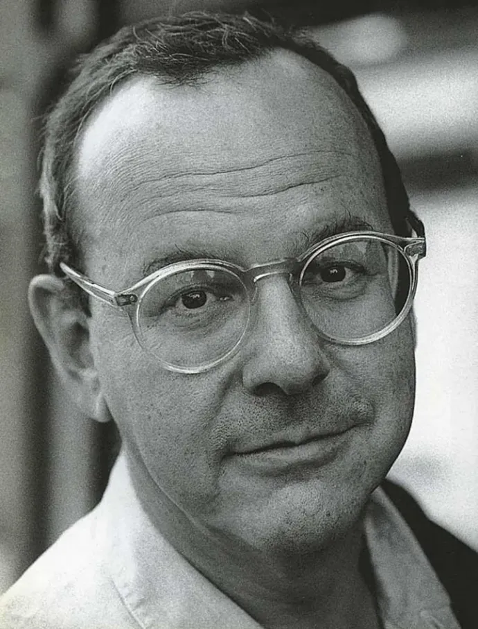
These words of commendation were published on an art and design blog 10 years ago when the man praised had been dead for almost a decade and a half. They are about Tibor Kálmán, a man who isn't only seen as a legend by posterity – he already was considered a legend in the 90s: he was one of the most influential designers of the era, and shook up half the world as editor-in-chief of Benetton's Colors magazine.
Born in Budapest in 1949, the graphic designer became well-known from the moment he introduced the theme of social responsibility to the magazine, and he was as provocative, unvarnished, bold and creative in his commentary on such issues as he was in his art.
Kálmán was not chosen for the post by the Italian clothing company by chance, as he had already distinguished himself in several areas of the creative industry long before he became editor-in-chief of Colors, such as
- as an art director (Artforum);
- as a creative director (Interview magazine);
- and as head of an industrial design and graphics company (M&Co).
His clients and work included names familiar to European ears, such as MTV, MOMA, the aforementioned Talking Heads and the development project on New York's 42nd Street.
Fleeing Soviet occupation, Tibor Kálmán and his family emigrated to the United States in 1956, when he was 7. He grew up in the small town of Poughkeepsie, New York, and went to college in New York, where he studied journalism, but then dropped out and worked at a sugar cane plantation in Cuba for some time. He returned to New York, worked in a bookstore, and in just a few years he was shaping the image of dozens of bookstores. He founded the design studio M&Co with his illustrator wife and a few colleagues. It was here that he developed his unique style, which was strongly influenced by the idea of social responsibility.
He was already trying to persuade his clients to include social and political messages in their advertising at that time.
He was able to fulfil this ambition when he became editor-in-chief of Colors magazine in 1991, first in New York and then, two years later, when he and his family moved to Rome. But four years later, partly due to the onset of illness, he returned to New York and began to think about how to produce a really good international magazine. This might have been achieved if the type of leukemia he was fighting was curable.
Wired magazine interviewed him after his return home, and the very opening of the interview indicates that, although he had always considered himself a visual person, he had no problem finding the right words to express himself.
"We live in a society, a culture and an economic model that is all about making everything look good. There are computers, for example. Why are they all putty-coloured or dirty fucking white? They make something off-white or beige because they are afraid to use a different colour – because they don't want to offend anyone. But clearly, if you make something that nobody hates, nobody will like it either.
So I'm interested in imperfection, weirdness, madness, and unpredictability. That's what we pay attention to anyway; we don't talk about planes when they fly, we talk about them when they crash."
While excerpts from Kálmán's interviews could fill several articles – if I had to offer just one, this is it – yet he hasn't become the Paulo Coelho of graphic design, if only because behind his every sentence he reveals an uncompromising, deeply and critically thinking humanist, working specifically against the illusion of simple truths.
Here are two quotes from Kálmán to illustrate what you can expect if you google his name:
"It's always the madmen working in garages who move things forward. There's always a garage and there's always antisocial behaviour. I think that without those two things, there is no real cultural progress."
And:
"What we need is fewer people imagining what robots can do and more people thinking about racism."
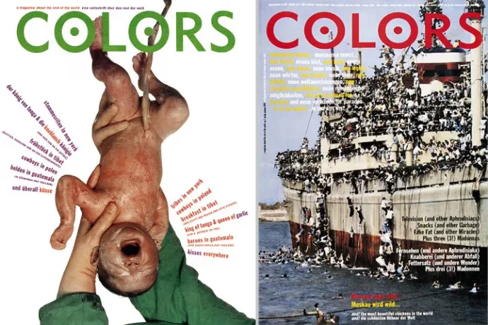
The world first took note of Kálmán's name when he became editor-in-chief of Colors magazine. Colors' slogan claimed that it was "about the rest of the world", no matter what we mean by "the rest". Kálmán's arrival instantly catapulted the magazine to worldwide fame. He often promoted the idea of multiculturalism in radical ways, and impressed his readers with an outspoken visuality that previously hadn't been seen. Kálmán saw the magazine as a kind of progressive educational tool, encouraging people to look at many things, such as race, differently.
“If someone allows me to make a publication that is politically and culturally progressive and doesn't tell me to put their favorite movie stars on the cover, if I get to do what I want in an honest way – as I did in the beginning at ‘Colors’ – then I’m going to do it.”
– he once said in an interview.
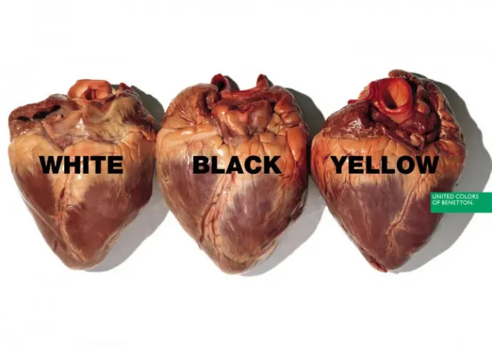
Kálmán worked with bold, provocative and striking visuals, for example when he depicted Ronald Reagan as a shrivelled-up AIDS patient and Queen Elizabeth as a coloured woman. It is possible that the cover of the magazine, showing a newborn baby or the one with three almost identical – presumably – human hearts side by side with only one word: white, yellow, black, left a deep impression on many. The Benetton logo is on the edge of the picture.
As Kálmán said in an interview, although Benetton did indeed sponsor the team that produced the magazine, this did not affect their creative freedom. "We were never under any pressure to do articles about sweaters or Luciano Benetton’s art collection.
We did articles about poverty, different cultures, things that mattered. The amount of influence our sponsor or advertisers had over our publication was less than in other supposedly “independent” commercial magazines I’ve worked for. We were free."
So Kálmán used graphics to change the world, and to some extent, he succeeded. The magazine quickly gained a huge following, especially among young people, Benetton's image was enhanced and Kálman edited the magazine for 4 years – as long as he felt comfortable in his job and until he fell ill. He then resigned, returned to New York in 1995, and reopened the M&Co agency (which has gone on to train a bunch of highly influential graphic artists). His biography, Perverse Optimist, was published in 1998. He died a year later.
Who knows whether his origins played a role in his critical thinking and unique vision, but in any case, he said, "I was born in Hungary, so I have always looked at the US through the eyes of a foreigner". Cliché as it may seem, he was truly ahead of his time, if you think about it: a decade before Instagram and TikTok, he proclaimed that images can communicate much more powerfully than words.
If you enjoyed this story, and want to make sure you don't miss similar ones in the future, subscribe to the Telex English newsletter!